
 Get started
The Shopify product page checklist: 14 things to check before you send traffic
Every shopper arrives on a product page with the same handful of questions. A page that answers them sells; a page that leaves them open sends people back to search. Here are 14 checks, grouped by the question each one answers, with links to step-by-step guides.
A fresh Shopify theme gives you a tidy product page: photo, title, price, variants, buy buttons and a description. It looks finished. But look at it the way a first-time shopper does and the questions start: what does delivery cost, when will it arrive, can I send it back, is this the right size, is this store real?
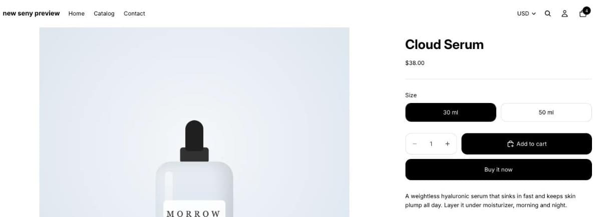
Use this list on your best-selling product first. Open it on your phone, because that’s where most shoppers will see it.
“What exactly is this?”
- Several photos, including one in use. Show the product from more than one side, in someone’s hand or in a room, and with a sense of size. Give every image a short description (alt text) in the product’s Media section: screen reader users rely on it, and the European Accessibility Act expects it.
- A description you can scan. Lead with what it does for the shopper, then the facts in a short list: size, materials, how to use it. Avoid vague “eco” or “natural” claims you can’t prove; the EU banned generic green claims from September 2026.
“What will it really cost?”
- An honest price. If you show a crossed-out price, it must be your lowest price of the last 30 days. See the 30-day lowest price rule.
- Delivery cost before checkout. Unexpected shipping costs are a classic reason to leave at checkout. Say what delivery costs, or how far the shopper is from free delivery, right on the page. A free shipping progress bar does both.
“When will it arrive, and can I send it back?”
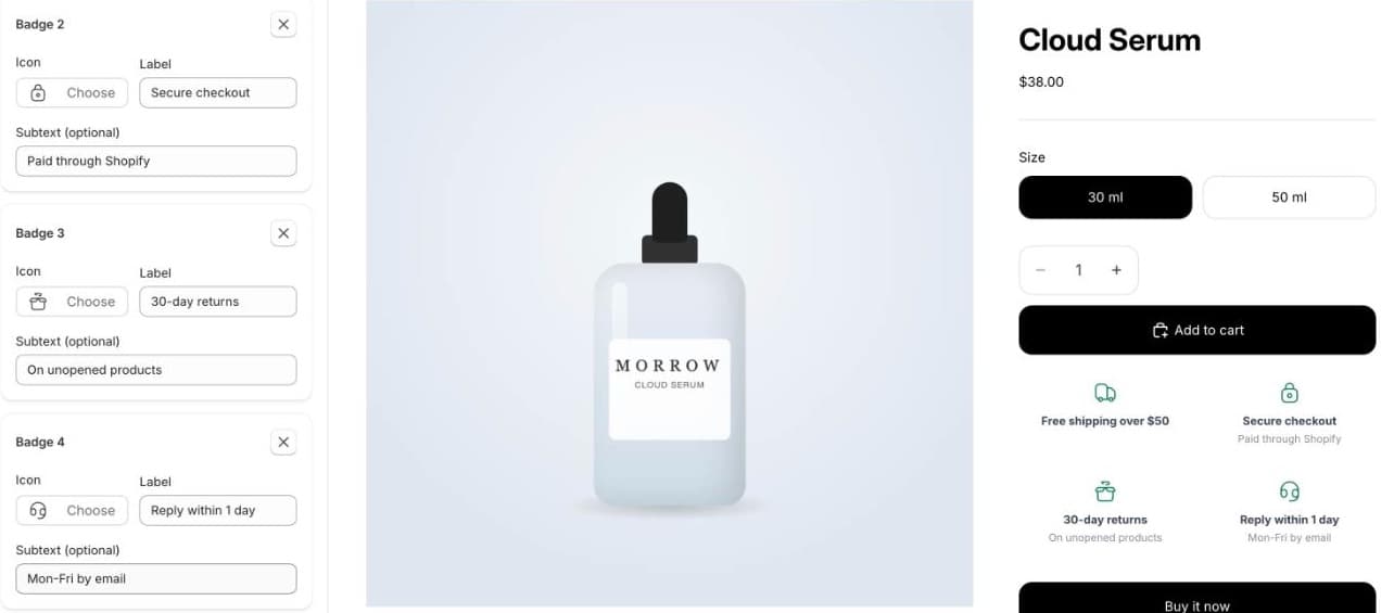
- Delivery time and returns, as specific facts. “Ships in 1–2 working days” and “30-day returns” next to the buy button answer two questions in one line. Generic badges such as “Fast shipping” answer neither. See how to add trust badges.
- The payment methods you accept. Show their logos near the button, especially local ones. In Lithuania, that means bank links.
“Is this the right one for me?”
- Clear variants and stock. Sold-out sizes should look sold out, with words and not only grey colour. Decide what happens to products that run out: see hide or show out-of-stock products.
- Answers to the questions people actually ask. Collect the questions customers email you and answer them under the description in a FAQ section.
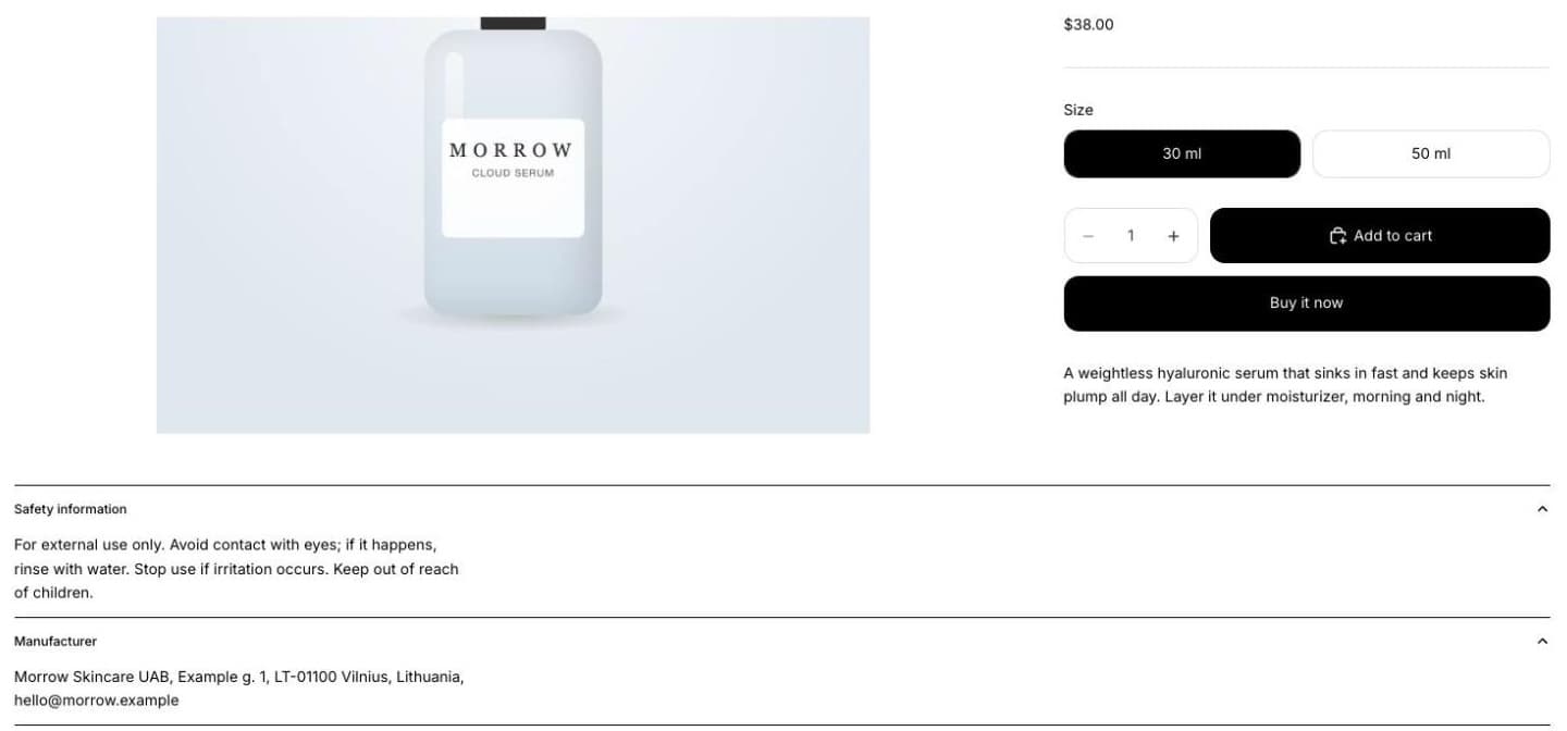
- Product safety information. In the EU, the manufacturer’s details and any warnings must be shown on the page. GPSR on Shopify shows how to do it with metafields.
“Can I trust this store?”
- Reviews from real customers. Show the rating near the title and the reviews lower down. Only real ones: invented reviews are banned in the EU.
- A visible way to ask. A contact link, chat or a WhatsApp button catches the shopper who has one question left before buying.
“Is there a better deal?”
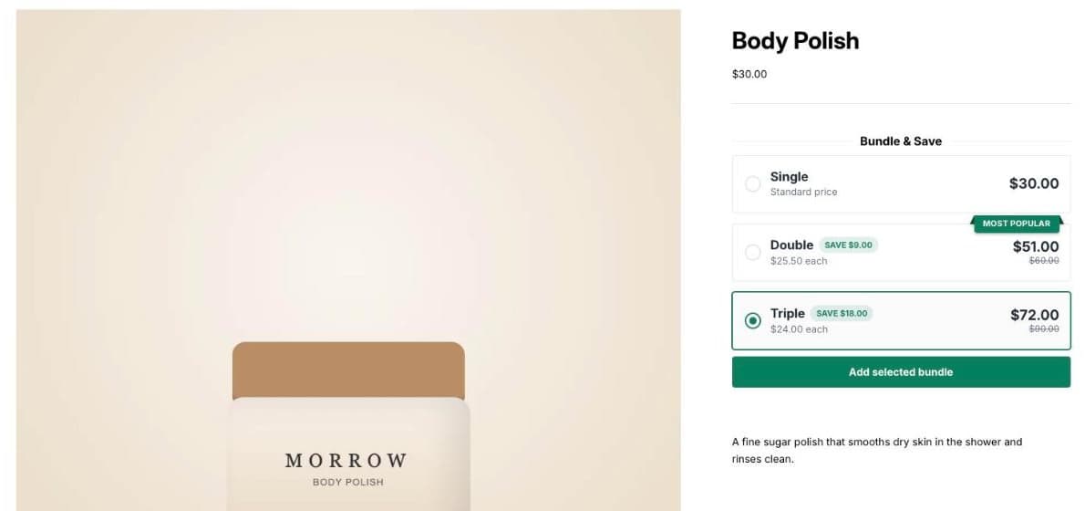
- One clear offer, not five. A quantity discount for products people buy more than one of, or a frequently bought together add-on for products that need something else. Pick the one that fits the product; stacking every offer on one page makes none of them readable.
“Can I buy this easily on my phone?”
- A buy button that’s always within reach. On a phone, the button disappears as soon as the shopper scrolls into the description. A sticky add to cart bar keeps it on screen.
- A fast page. Every app adds code. Check your speed and remove what you don’t use, as explained in how apps slow down a Shopify store.
Doing it with Seny
Most items on this list are a ready-made Seny app: trust badges, payment logos, the free shipping bar, quantity offers, add-ons, the FAQ section, the WhatsApp button and the sticky buy bar. They load through one app embed and match your theme’s colours when you open them. Change the text and placement in the design panel and publish; nothing needs code.
Trust BadgesDelivery, returns and payment facts right under the buy button.Explore app